Rule 2: Design in Black & White First
Designing in grayscale before adding color simplifies the most complex element of visual design– and forces you to focus on spacing and laying out elements.
UX designers are really into designing “mobile-first” these days. That means you think about how pages and interactions work on a phone beforeimagining them on your zillion-pixel Retina monitor.
That sort of constraint is great. It clarifies thinking. You start with the harder problem (usable app on a teeny-weeny screen), then adopt the solution to the easier problem (usable app on a large screen).
Well here’s another similar constraint: design black and white first. Start with the harder problem of making the app beautiful and usable in every way, but without the aid of color. Add color last, and even then, only with purpose.

This is a reliable and easy way to keep apps looking “clean” and “simple”.Having too many colors in too many places is a really easy way to screw up clean/simple. B&WF forces you to focus on things like spacing, sizes, and layout first. And those are the primary concerns of a clean and simple design.


There are some cases where B&WF isn’t as useful. Designs that have a strong specific attitude— “sporty”, “flashy”, “cartoony”, etc. — need a designer who can use color extremely well. But most apps don’t have a specific attitude except clean and simple. Those that do are admittedly much harder to design.
For all the rest, there’s B&WF.
Step 2: How to add color
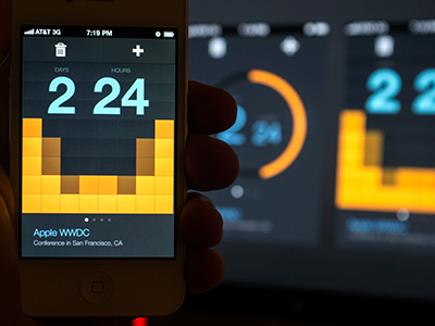
The simplest color to add is one color.
Adding one color to a grayscale site draws the eye simply and effectively.

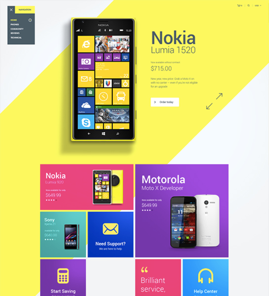
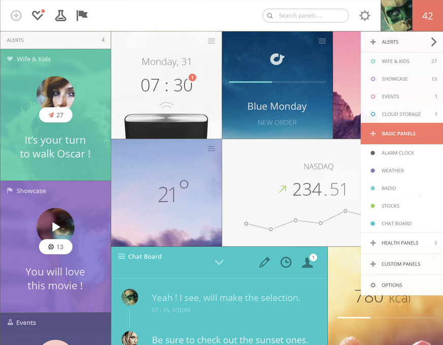
You can also take it one step up. Grayscale + two colors, or grayscale + multiple colors of a single hue.
Color codes in practice — i.e. wait, what’s a hue?
The web by and large talks about color as RGB hex codes. It’s most useful to ignore those. RGB is not a good framework for coloring designs. Much more useful isHSB (which is “basically synonymous” with HSV or HSL).
HSB is better than RGB because it fits with the way we think about color naturally, and you can predict how changes to the HSB values will affect the color you’re looking at.
If this is news to you, here’s a good primer on HSB colors.


By modifying the saturation and brightness of a single hue, you can generate multiple colors— darks, lights, backgrounds, accents, eye-catchers— but it’s not overwhelming on the eye.
Using multiple colors from one or two base hues is the most reliable way to accentuate and neutralize elements without making the design messy.
A few other notes on color
Color is the most complicated area of visual design. And while a lot of stuff on color is obtuse and not practical for finishing the design in front of you, I’ve seen some really good stuff out there.
A small toolbox:
- Never Use Black (Ian Storm Taylor). Talks about how totally flat grays almost never appear in the real-world, and how saturating your shades of gray– especially your darker shades– adds a visual richness to your designs. Plus, saturated grays more closely mimic the real-world, which is its own virtue.
- Adobe Color CC. An awesome tool for finding, modifying, and creating color schemes.
- Dribbble search-by-color. Another awesome way to find what works with a particular color. Talk about practical. If you already have one color decided, come look at what the world’s best designers are doing/matching with that color.