Rule 3: Double The Whitespace
To make UI that looks designed, add a lot of breathing room.
In Rule 2, I said that B&WF forces designers to think about spacing and layout before considering color, and how that’s a good thing. Well, it’s time we talk about spacing and layout.
If you’ve coded HTML from scratch, you’re probably familiar with the way HTML is, by default, laid out on the page.
Basically, everything is smashed towards the top of the screen. The fonts are small; there’s absolutely no space between lines. There’s a biiit of space between paragraphs, but it isn’t much. The paragraphs just stretch on to the end of the page, whether that’s 100 px or 10,000 px.
Aesthetically speaking, that’s awful. If you want to make UI that looks designed, you need to add in a lot of breathing room.
Sometimes a ridiculous amount.
Whitespace, HTML, and CSS
If you, like me, are used to formatting with CSS, where the default is no whitespace, it’s time to untrain yourself of those bad habits. Start thinking of whitespace as the default— everything starts as whitespace, until you take it away by adding a page element.
Sound zen? I think it’s a big reason people still sketch this stuff.
Starting with a blank page means starting with nothing but whitespace. You think of margins and spacing right from the very beginning. Everything you draw is a conscious whitespace-removing decision.
Starting with a bunch of unstyled HTML means starting with content. Spacing is the afterthought. It has to be explicitly stated.
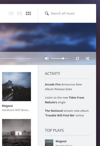
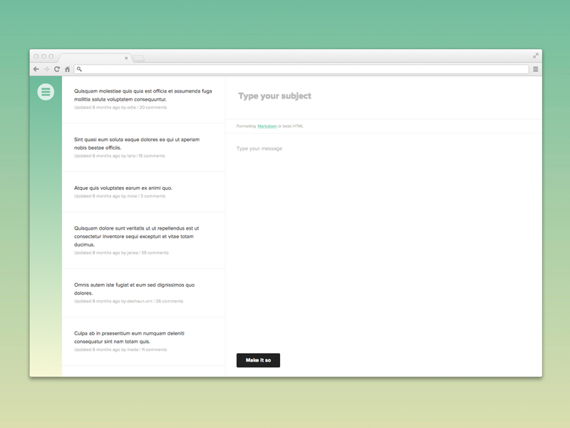
Here’s an illustrative music player concept by Piotr Kwiatkowski.
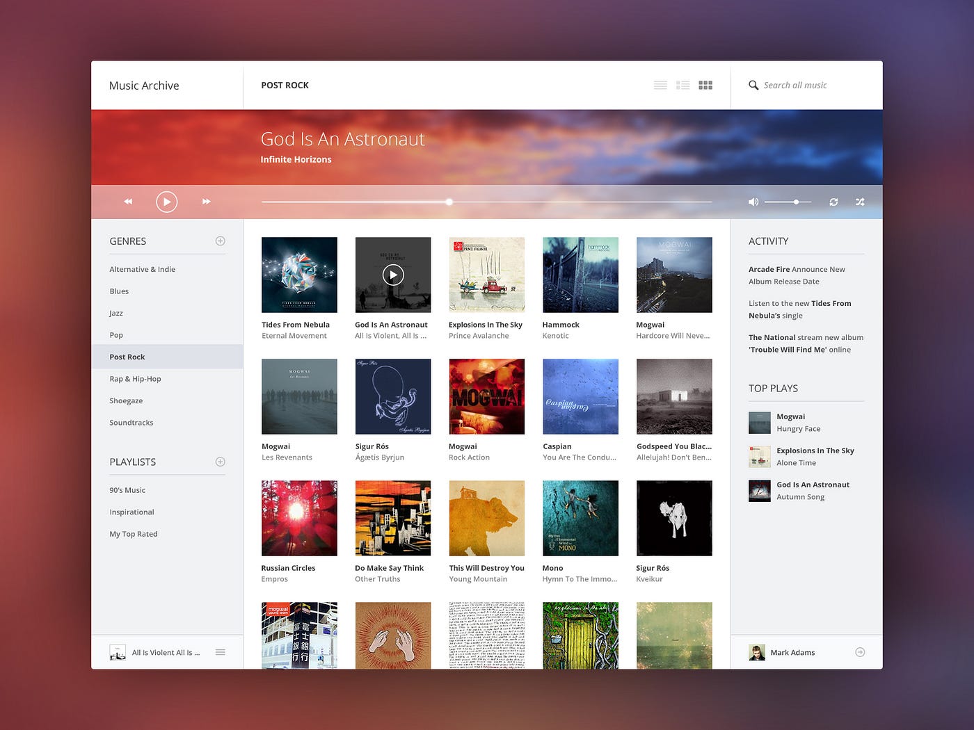
Pay particular attention to the menu on the left.
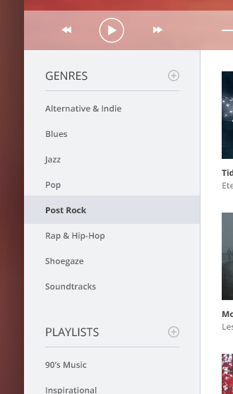
The vertical space between the menu items is fully twice the height of the text itself. You’re looking at 12px font with just as much padding above and below it.
Or take a look at the list titles.There’s a 15px space between the word “PLAYLISTS” and its own underline. That’s more than thecap height of the font itself! And that’s to say nothing of the 25 pixels between the lists.
The left sidebar shows generous spacing in between lines of text, and more.
Piotr was conscientious about putting in extra space here, and it paid off. While this is just a concept he put together for the fun of it (as far as I know), as far as aesthetics go, it’s beautiful enough to compete with the best music UIs out there.
Good, generous whitespace can make some of the messiest interfaces look inviting and simple— like forums.
Or Wikipedia.
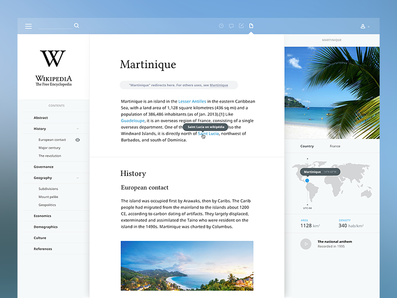
You can find plenty of argument that, say, the Wikipedia redesign leaves out key functionality to using the site. But you can’t say it’s not a good way to learn!
Put space between your lines.
Put space between your elements.
Put space between your groups of elements.
Analyze what works.