Rule 1: Make Lighting Come From Above
Shadows are invaluable cues in telling the human brain what user interface elements we’re looking at.
This is perhaps the most important non-obvious thing to learn about UI design: light comes from the sky. Light comes from the sky so frequently and consistently that for it to come from below actually looks freaky.

When light comes from the sky, it illuminates the tops of things and casts shadows below them. The tops of stuff are lighter, the bottoms are darker.
You wouldn’t think of people’s lower eyelids as being particularly shaded, but shine some light on those suckers and all of a sudden it’s demon girl at your front door.
Well, the same is true for UI. Just as we have little shadows on all the undersides of all our facial features, there are shadows on the undersides of just about every UI element you can find. Our screens are flat, but we’ve invested a great amount of art into making just about everything on them appear be 3-D.
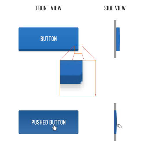
Take buttons. Even with this relatively “flat” button, there are still a handful of light-related details:
- The unpushed button (top) has a dark bottom edge. Sun don’t shine there, son.
- The unpushed button is slightly brighter at the top than at the bottom. This is because it imitates a slightly curved surface. Just as how you’d need to tilt a mirror held in front of you up to see the sun in it, surfaces that are tilted up reflect a biiiiit more of the sun’s light towards you.
- The unpushed button casts a subtle shadow– perhaps easier to see in the magnified section.
- The pushed button, while still darker at the bottom than at the top, isoverall darker– this is because it’s at the plane of the screen and the sun can’t hit it as easily. One could argue that all the pushed buttons we see in real life are darker too, because our hands are blocking the light.
That was just a button, and yet there are these 4 little light effects present. That’s the lesson here. Now we just apply it to everything.
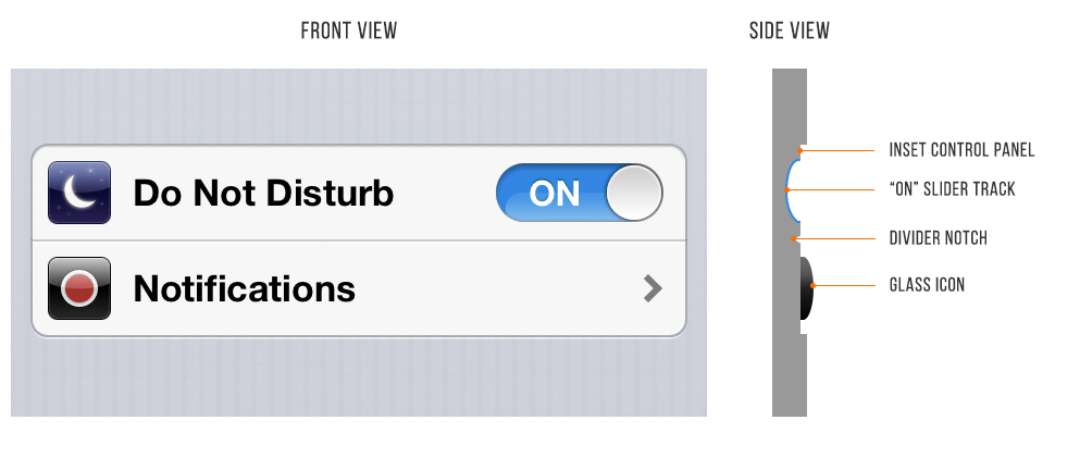
Here is a pair of iOS 6 settings— “Do Not Disturb” and “Notifications”. NBD, right? But look how many light effects are going on with them.
- The top lip of the inset control panel casts a small shadow
- The “ON” slider track is also immediately set in a bit
- The “ON” slider track is concave and the bottom reflects more light
- The icons are set out a bit. See the bright border around the top of them? This represents a surface perpendicular to the light source, hence receiving a lot of light, hence bouncing a lot of light into your eyes.
- The divider notch is shadowed where angled away from the sun and vice versa
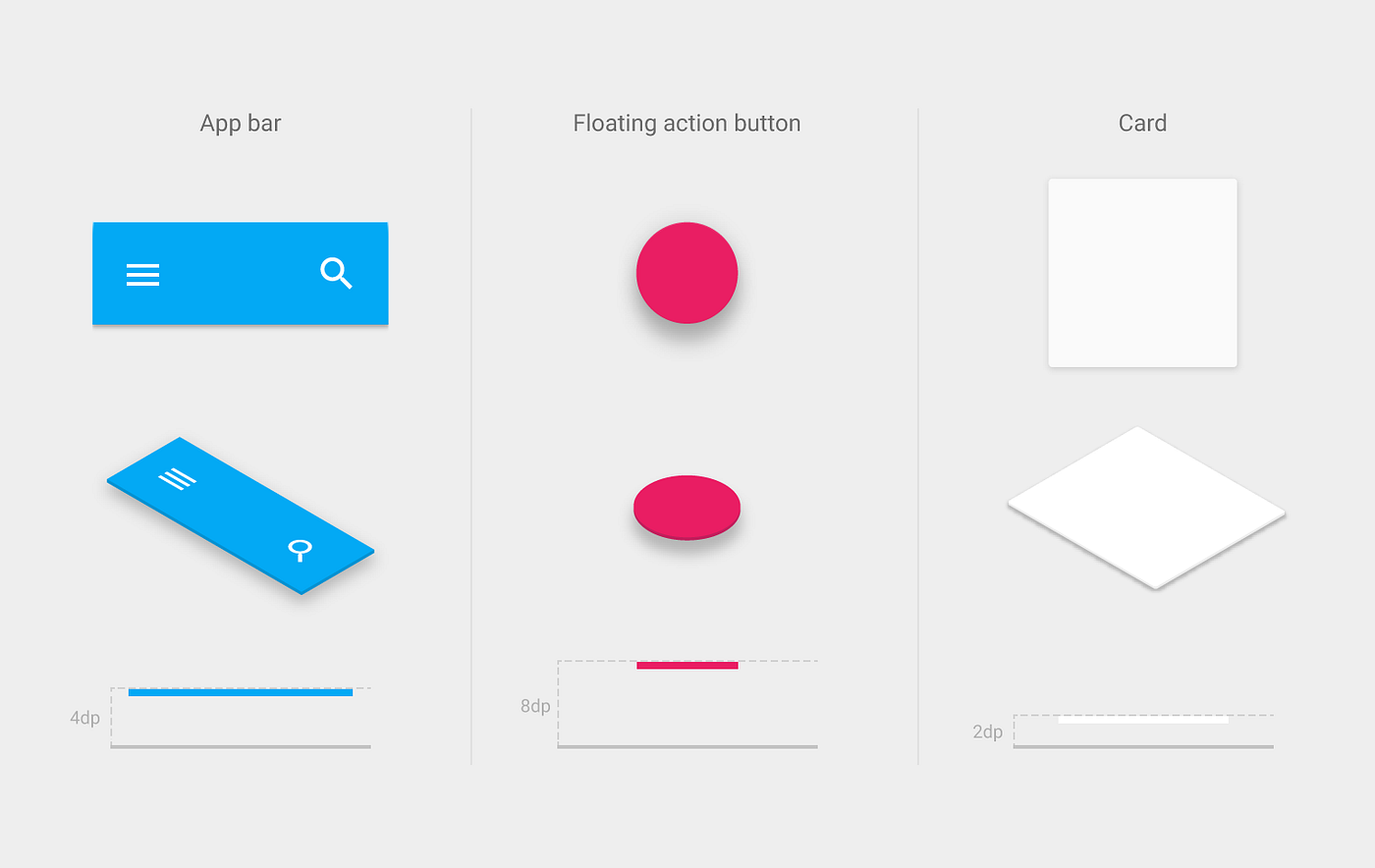
Elements that are generally inset:
- Text input fields
- Pressed buttons
- Slider tracks
- Radio button (unselected)
- Checkboxes
Elements that are generally outset:
- Buttons (unpressed)
- Slider buttons
- Dropdown controls
- Cards
- The button part of a selected radio button
- Popups
Now that you know, you’ll notice it everywhere. You’re welcome, kid.
Wait, what about flat design?
iOS7 made a stir in the tech community for its “flat design”. This is to say that it is literally flat. There are no simulated protrusions or indentations— just lines and shapes of solid color.
I love clean and simple as much as the next guy, but I don’t think this is a long-term trend here. The subtle simulation of 3-D in our interfaces seems far too natural to give up entirely.
More likely, we’ll see semi-flat UI in the near future (and this is what I recommend you become proficient in designing). I’m going to go ahead and call it “flatty design”. Still clean, still simple, but you’ll have some shadows and cues for what to tap/slide/click.
As I’m writing this, Google is rolling out their “Material Design” language across their products. It’s a unified visual language that– at its core– seeks to imitate the physical world.
An illustration from the Material Design guide shows how to convey different depths using different shadows.
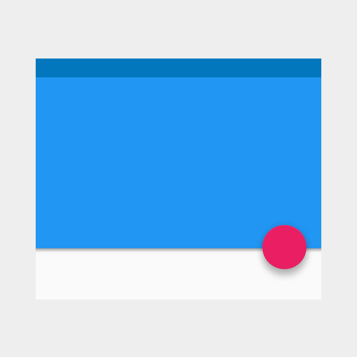
This is the sort of thing I see sticking around.
It uses subtle real-world cues to convey information. Key word,subtle.
You can’t say it doesn’t imitate the real-world, but it’s also not the web of 2006. There are no textures, no gradients, no sheens.
Flatty is the way of the future, I think. Flat? Psh, just a thing of the past.