Rule 4: Overlay Text on Images
There are only a few ways of reliably and beautifully overlaying text on images. Here are five— and a bonus method.
If you want to be a good UI designer, you’ll have to learn how to put text over images in an appealing way. This is something that every good UI designer does well and something every bad UI designer does piss-poorly— or just doesn’t do, in which case you’ll have a huge leg up after reading this section!
Method 0: Apply text directly to image
I hesitate to even include this, but it is technically possible to put text directly on an image and have it look OK.

Otter Surfboards. Hip and Instagrammy, but a bit difficult to read.
There are all sorts of problems and caveats with this method:
- The image should be dark, and not have a lot of contrast-y edges
- The text has to be white— I dare you to find a counter-example that’s clean and simple. Seriously. Just one.
- Test it at every screen/window size to make sure it’s legible
Got all those? Great. Now never change the text or the image, and you should be good to go.
I don’t think I’ve ever used text directly on top of an image for any professional project, and it’s really mentioned here as a sort of “control” method. That being said, it’s possible to do to really cool effect— but be careful.
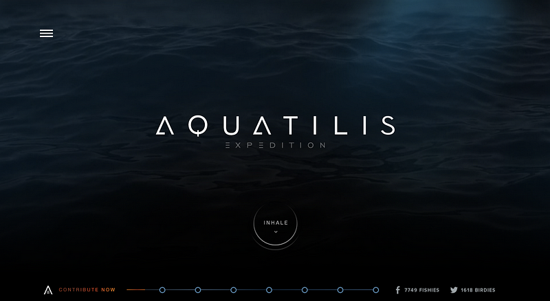
The Aquatilis website– definitely worth a visit.
Method 1: Overlay the whole image
Perhaps the easiest method to put text on an image is to overlay the image. If the original image isn’t dark enough, you can overlay the whole thing with translucent black.
Here’s a trendy splash image with a dark overlay.

Upstart website has a 35% opacity black filter.
If you hop into Firebug and remove the overlay, you’ll see that the original image was too bright and had too much contrast for the text to be legible. But with a dark overlay, no problem!
This method also works great for thumbnails or small images.
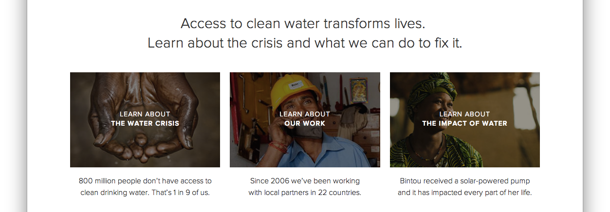
Thumbnails fromcharity:water site
And while a black overlay is simplest and most versatile, you can certainly find colored overlays as well.

Method 2: Text-in-a-box
This is dead simple and very reliable. Whip up a mildly-transparent black rectangle and lather on some white text. If the overlay is opaque enough, you can have just about any image underneath and the text will still be totally legible.
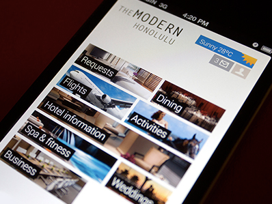
Modern Honolulu iPhone Concept by Miguel Oliva Márquez
You can also throw in some color — but, as always, be judicious.

Now in pink. By Mark Conlan
Method 3: Blur the image
A surprisingly good way for making overlaid text legible is to blur part of the underlying image.

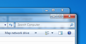
iOS 7 has really made background blurring a thing recently, though Vista used it to great effect too.

You can also use the out-of-focus area of a photo as the blur. But beware— this method is not as dynamic. If your image ever changes, make sure the text is always over the blurry bits.

I mean, just try to read the subheader below.

Method 4: Floor fade
The floor fade is when you have an image that subtly fades towards black at the bottom, and then there’s white text written over it. This is an ingenious method, and I have no idea who did it before Medium, but that’s where I first noticed it.
To the casual observer, it appears that these Medium collections are displayed by plastering some white text over an image— but in response to that, I say false! There’s ever-so-subtle a gradient from the middle (black at 0% opacity) to the bottom (black at, ehhhhh maybe ‘bout 20% opacity).
Difficult to see, but definitely there, and definitely improving legibility.
Also notice that the Medium collection thumbnails use a slight text shadow to further increase legibility. Those guys are good!
The net effect is Medium can layer just about any text on any image and have a readable result.
Oh, and another thing— why does the image fade black at the bottom? For the answer to that, see Rule 1— light always comes from the top. To look most natural to our eye, the image has to be slightly darker at the bottom, just like everything else we ever see.
Advanced move: mix the blur with the floor flade… introducing The Floor Blur.

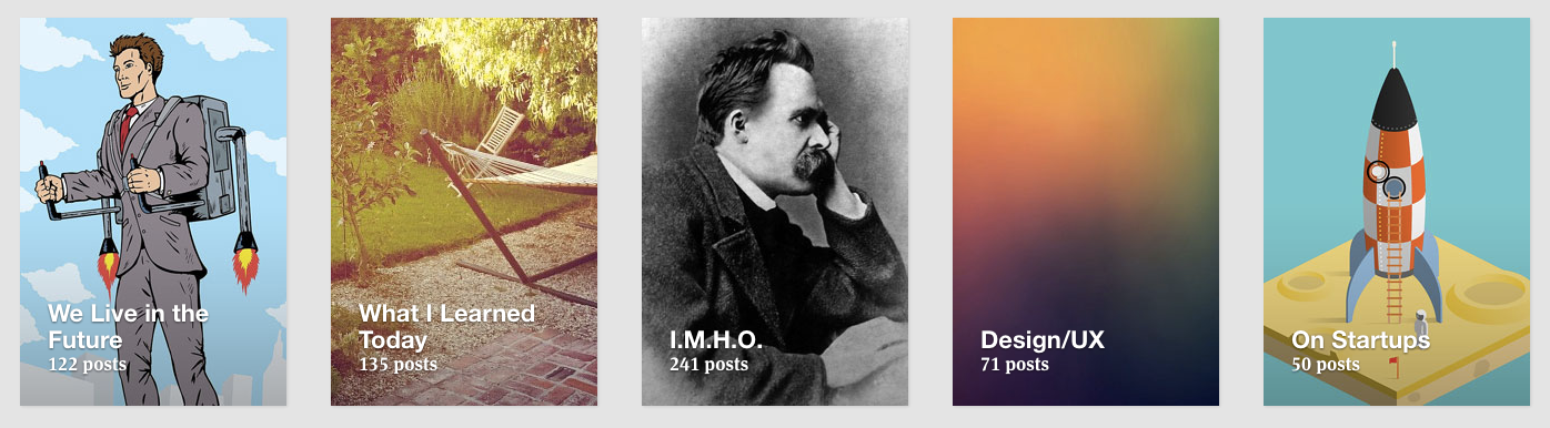
Bonus Method: Scrim
How does the Elastica blog have a readable headline on top of a dynamic image every single time? The images are:
- Not particularly dark
- Kind of contrast-y
Yet it’s difficult to describe why the text is so legible. Take a look:

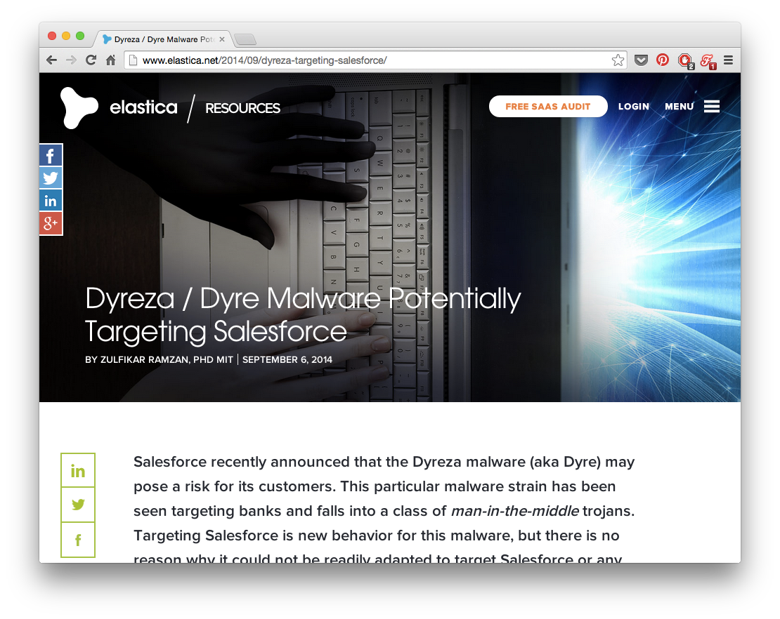
Answer: the scrim.
A scrim is a piece of photography equipment that makes light softer. Now it’s also a visual design technique for softening an image so overlaid text is more legible.
If we browser zoom out on the Elastica blog, we can more clearly see what’s going on.
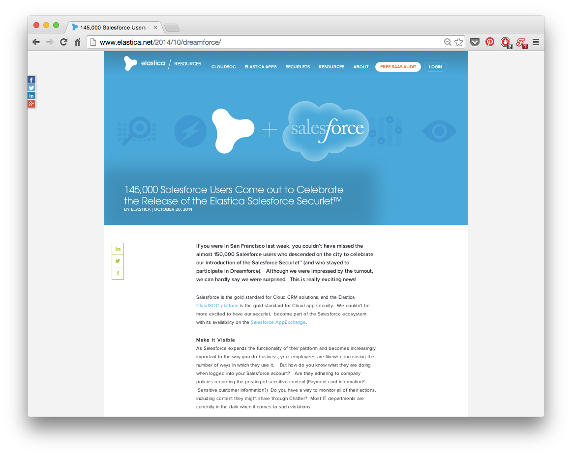
There is a gradiated-opacity box around the “145,000 Salesforce Users Come out to Celebrate…” headline. It’s easier to notice against the solid blue background than against the contrast-y photos above it.
This is probably the most subtle way of reliably overlaying text on images out there, and I haven’t seen it anywhere else (but it is pretty sneaky). Mark it down, though. You never know when you’ll need it.