Rule 5: Make Text Pop
Styling text to look beautiful and appropriate is often a matter of styling it in contrasting ways— for instance, larger but lighter.
In my opinion, one of the hardest parts of creating a beautiful UI is styling text— and it’s certainly not for unfamiliarity with the options. If you’ve made it through grade school, you’ve probably used every method of calling attention to or away from text that we see:
- Size (bigger or smaller)
- Color (greater contrast or lesser; bright colors draw the eye)
- Font weight (bolder or thinner)
- Capitalization (lowercase, UPPERCASE, and Title Case)
- Italicization
- Letter spacing (or— fancy term alert— tracking!)
- Margins (technically not a property of the text itself, but can be used to draw attention, so it makes the list)
There are a few other options that are possible for drawing your attention, but not particularly used or recommended:
- Underline. Underline means links nowadays, and it’s not worth trying to force it to mean anything else, if you ask me
- Text background color. Not as common, but the 37signals website had this as link styling for a while
- Strikethrough. Back off, you 90s CSS wizard, you!
In my personal experience, when I find a text element that I can’t seem to find the “right” styling for, it’s not because I forgot to try caps or a darker color— it’s because the best solution is often getting right a combo of “competing” properties.
Up-pop and down-pop
You can divide all the ways of styling text into two groups:
- Styles that increase visibility of the text. Big, bold, capitalized, etc.
- Styles that decrease visibility of the text. Small, less contrast, less margin, etc.
We’ll call those “up-pop” and “down-pop” styles, in honor of designers’favorite adjective. We won’t call it “visual weight”, because that is boring.
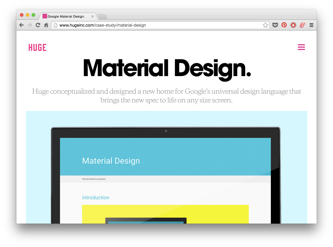
Lots of up-pop going on with the “Material Design” title. It’s big; it’s high-contrast; it’s very bold.

The items in this footer, on the other hand, are down-popped. They’resmall, lower-contrast, and a less bold font-weight.
Now the important part.
Page titles are the only element to style all-out up-pop.
For everything else, you need up- and down-pop.
If a site element needs emphasis, apply both up-pop and down-pop styles. This will prevent things from being overwhelming, but allow different elements the visual weight they should have.
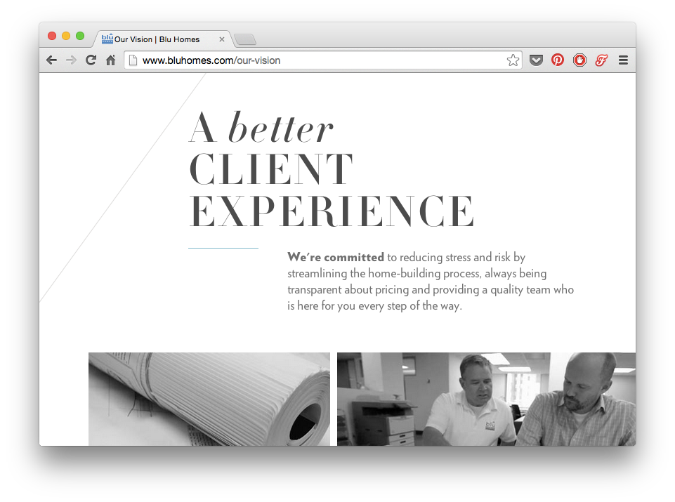
The impeccably-designed Blu Homes website has some big titles, but the emphasized word is lowercase— too much emphasis would look overpowering.

These numbers on the Blu Homes site draw your eye with their size, color, and alignment— but notice that they’re simultaneously downplayed with a very light font-weight, and lower-contrast color than the dark gray.
The small labels below the numbers, however, while gray and small, are also uppercase and very bold.
It’s all about the balance.
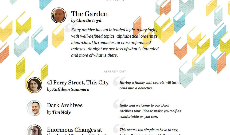
Contents Magazine is a good case study in up/down-pop.
- The article titles are basically the only non-italicized page elements. In this case, lack of italicization more effectively draws the eye (particularly in combination with the bold font-weight)
- The author’s name is bolded in the byline— making it stand out from the normal-weight “by”
- The small, low-contrast “ALREADY OUT” text stays out of the way— but with its uppercase type, generous letter-spacing, and large margins, you can see it the moment you look for it
Selected and hovered styles
Styling selected elements and hover effects are another round in the same game— but more difficult.
Usually, changing font-size, case, or font-weight will change how large of an area the text takes up, which can lead to seizing hover effects.
What does that leave you with?
- Text color
- Background color
- Shadows
- Underlining
- Slight animations— raising, lowering, etc.
One solid option: try turning white elements colored, or turning colored elements white, but darkening the background behind them.